You can easily make similar experiments with your own pictures - but remember: work on a copy, not on the original file! I've used the filters available in typical digital photo manipulation software, often several of them on top of each other, by using layers and layering effects.
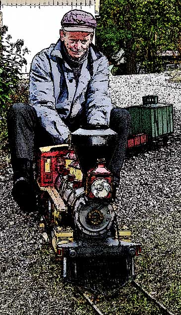
This image, for instance, contains a background with a weakened color saturation and focus, and on top of that is a black line image, made by utilizing a filter that accentuates edges only.
No. 1, SCORE +5
Comments:
+ simple but appealing
+ nice to see sheer joy shining through the enhancement
I personally like this one, myself. It reminds me of the illustrative style used in magazines many decades ago...
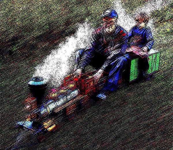
Grain, motion blur and edge enhancement give a feeling of speed in this image:
No. 2, SCORE -1
Comments:
+ I like it because of the child
+ The child is really tickled with his ride
- seems harsh
- too jittery
This one simulates the "tone-line-effect" popular among "art-photographers" in the 1970s - back then, it was made by rotating sandwiched sheet film negatives on a 33 1/3 rpm record player during exposure! Now, this effect was created with just a few mouse clicks - however, I really should have removed the distracting double contour around engineer and passenger...
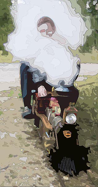
A poster-like image; as if made of cut-out colored paper:
No. 3, SCORE -11
Comments:
+ I like the softness
- too much steam
- diffused just too much
- too much mosaic
This, even though it shared the last position in the poll, is my own personal favorite... I especially like the graphic simplicity of the "floating head" enveloped in steam. So, its low score did surprise me a bit - only one "best" vote was sent in. But, tastes do differ!
If I hadn't decided to spend no more than 15 minutes on each of these examples, I would have worked more on this - removing the jaggedness and getting more detail around the smokebox and cowcatcher, for instance...
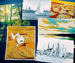
Back in the early 1970s, I made many images like the ones you see on this page - but manually and painstakingly, in the photographic darkroom. A "tone-separated" image with contour lines, like no. 3 here, would have necessitated a dozen or more lith-film negatives and positives, all made with different exposures, and subsequently sandwiched and exposed through filters onto photographic color paper. I often spent many, many darkroom hours on a single image! I guess the collection of some of the ones I've saved (shown on the right) represents more than a week's worth of enjoyable outdoor photography and subsequent darkrom experimenting...
The basic image got a mosaic effect, and its color saturation has been enhanced. On top of that is a line image in black.
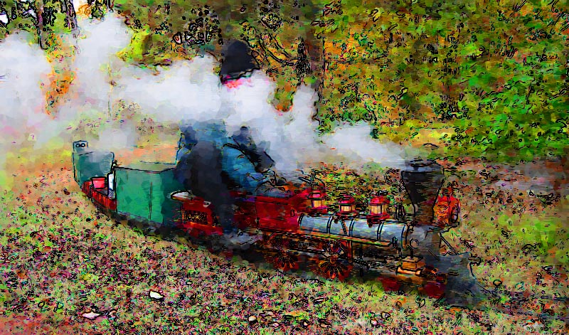
No. 4,
SCORE +5
Comments:
+ reminds me of a Monet
+ I like the rich colors
- I wish the smoke didn't obscure the face so much
- too bright/gaudy
I was trying to achieve an impressionistic effect here. This one could have been improved by removing the clutter of black outlines on the ground & in the trees, leaving only the color blotches...
A "watercolor effect" transparently superimposed on the basic image:
No. 5,
SCORE +14
Comments:
+ "calm-garden-impressionistic"
- background competes with loco
I wanted to keep the loco recognizable, so I didn't go for the full effect, but left 30% of the original image. This one got only one "worst" vote. Since this one shows the loco to its advantage, it was inevitable that it would get a high score. My personal second choice, after no. 3.
And still one more, an eerie rendition with an out-of-focus bacground with both dark and glowing lines:
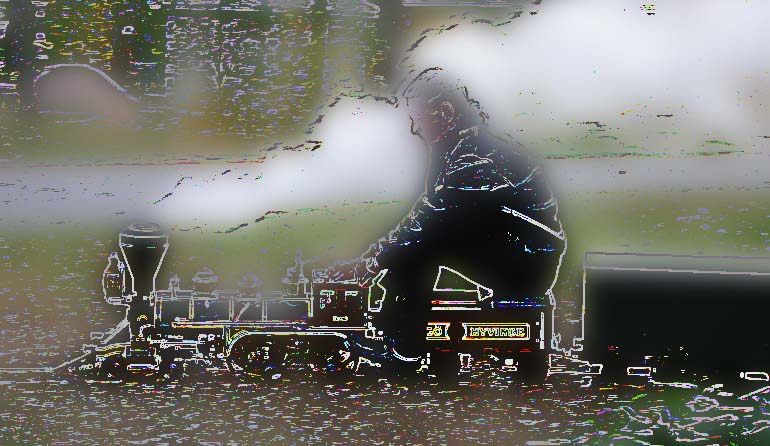
No. 6,
SCORE -12
Comments:
- too weird
- way overdone
Well, I like the "neon effect" in the lines, myself. But, you're right - it's weird! Not a single "best" vote - but even so, only 12 out of the total of 39 "worst" votes... ;-)
The results were somewhat predictable, but also rather interesting:
A few of the images got a lot of "best" votes, no. 5 clearly topping the list in that respect. No. 1 was probably liked because, despite the manipulation, it still looks pretty "normal" - this, in fact, may also have been the cause for the "worst" votes!
I was surprised, however, that no. 2 so clearly divided the opinion - it got almost equal amounts of "best" and "worst" votes. The negative response to no. 3 also surprised me - but, OTOH, this is the least loco-like of all the pictures. It was clear from the beginning that no. 6 would not be a favorite.
Here's a breakdown of the poll, in scoring order - interesting to see the form of the graph, "sliding" from best to worst:
No.          BEST       WORST         SCORE
5    +++++++++++++++|-                 +14
1           ++++++++|---                +5
4           ++++++++|---                +5
2            +++++++|--------           -1
3                  +|------------      -11
6                   |------------      -12
All in all, I spent a couple of intertesting hours at the computer making these image modifications (and the webpage), and enjoyed reading your votes and comments on the images. Thank you all for your input!
The token "prize draw" among all entrants (done by letting my computer generate a random number) sends the booklet "North Yorkshire Moors Railway" off via air mail to Brian Marriott.
A big "TOOT" for him!
Close this window when you are ready...
Any information presented on this website (especially any do-it-yourself instructions) is given without any acceptance of liability for damage or injury - so, always remember: SAFETY FIRST!
The material on this page and its related pages is Copyright © 2001-2007 by J-E Nystrom. You may NOT copy, transmit and/or publish any of my images or texts in print, electronically, on your own website or in any other way. The author retains all rights to this work, with this sole exception: Storing the pages on your own computer or printing out a paper copy, for your own, strictly personal use is allowed.
You may, however, freely link to the "Building Live Steam Locomotives" page at: http://www.saunalahti.fi/animato/steam, or to my Animation Home Page at: http://www.saunalahti.fi/animato. You should NOT link directly to THIS page, since it's address may change in the future. Also, you may not put any of these pages or pictures into "frames" on your own website.
Thank you.